

About Ambitio
Ambitio helps students navigate the complex world of postgraduate applications. Think of it as your personal admission expert guiding you through course selection, scholarship discovery, and application tracking. The platform connects ambitious students with their dream programs while giving admission counselors the tools to support dozens of applications simultaneously.
Overview
Ambitio helps students navigate the complex world of postgraduate applications. Think of it as your personal admission expert guiding you through course selection, scholarship discovery, and application tracking. The platform connects ambitious students with their dream programs while giving admission counselors the tools to support dozens of applications simultaneously.
Impact
14% increase in dashboard adoption
Platform Engagement
100% counselor migration from Excel
Workflow Efficiency
92% positive user feedback
Student Satisfaction
My Role
I owned the end-to-end redesign of the student dashboard from conducting user research with students and admission experts to defining information hierarchies, designing the interface, and working with developers through implementation. I balanced student needs with counselor workflows to create a tool that worked for both audiences.

The Challenge
Students applying to postgrad programs face decision paralysis. They're comparing hundreds of universities across dozens of factors tuition costs, acceptance rates, deadlines, rankings—while managing complex application requirements. The existing dashboard wasn't helping; it was just adding to the noise. Admission experts were similarly frustrated, maintaining parallel Excel sheets because the platform didn't surface the right information at the right time.
Solution
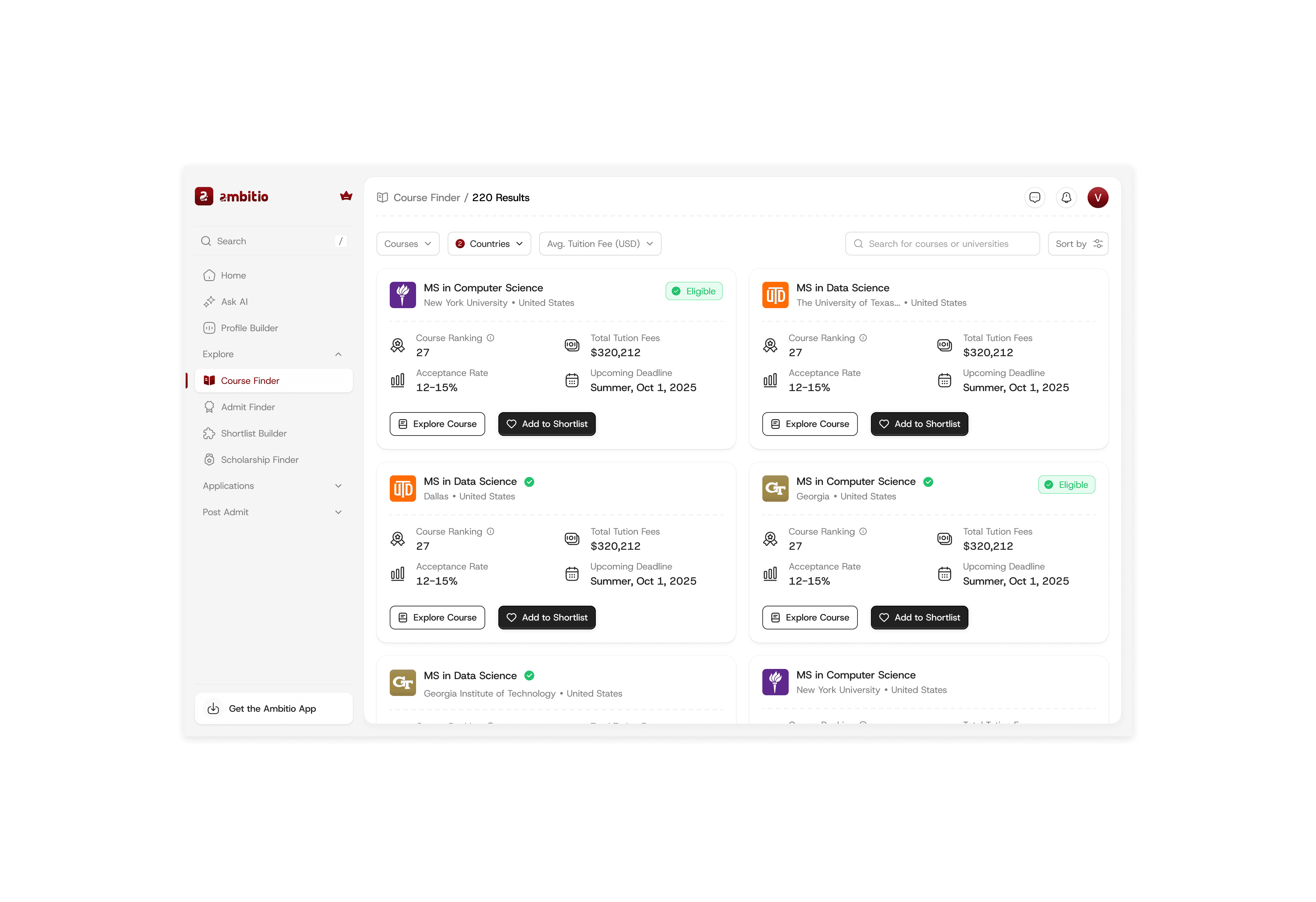
Course Finder: Surfacing What Actually Matters
Through research conversations with students, I identified the five factors that drive every course decision: ranking, tuition fees, acceptance rate, upcoming deadlines, and most critically am I even eligible? I redesigned the course finder around these data points, adding an eligibility indicator that pulls from students' onboarding profiles. This small pill became a game-changer: students could instantly see if a course was within reach before investing time in exploration. No more wasted effort on dead-end applications.
Scholarship Finder: From Cards to Clarity
The original card-based layout looked nice but made comparison nearly impossible. Students needed to mentally juggle scholarship amounts, deadlines, and eligibility across multiple cards. I switched to a table format admittedly less trendy, but infinitely more functional. Suddenly, students could scan columns, compare amounts at a glance, and make informed decisions about which scholarships deserved their attention. Sometimes the best design is the most obvious one.Application Management: Focus on What's Next
Students don't need to see every university they've ever browsed they need to track the ones they're actually applying to. I streamlined the manage applications view with smart filtering that surfaces only shortlisted universities, showing application status, required documents, and progress at a glance. Each application opens to a detailed document checklist, breaking down the intimidating application process into manageable tasks. Less scrolling, more doing.

Key Learnings
Research Prevents Assumptions: Talking to both students and admission experts early revealed that they needed fundamentally different views of the same data. This insight shaped the entire information architecture.
Sometimes Boring Wins: The table layout for scholarships wasn't exciting, but it solved the real problem comparison and decision-making. I learned to prioritize function over aesthetic trends when it matters.
Design for Both Sides: Creating a tool that worked for students while giving admission experts a reason to abandon Excel required understanding both workflows intimately. The best products serve multiple user types without compromise.
Small Signals, Big Impact: The eligibility indicator was a tiny design element that fundamentally changed how students engaged with courses. Good design often lives in these small, thoughtful details.